Vergelegen has long been recognised as a world-class winery, but its visual identity no longer reflected the richness of its heritage, the people behind its legacy or the natural abundance that defines the estate.
Elegant but overly corporate and restrained, it failed to capture the warmth, provenance and craftsmanship that have shaped Vergelegen for more than three centuries.
The challenge was to create a distinctive identity that could preserve this remarkable heritage while giving Vergelegen a more contemporary, welcoming and ownable expression – one worthy of representing South African winemaking on the world stage.
We worked with The Hardy Boys and Vergelegens brand team.
At the heart of the rebrand was a simple truth: everything extraordinary at Vergelegen is rooted in nature.
From the ancient soils and historic trees to the vineyards, architecture and generations of people who have shaped the estate, Roots became the strategic idea that revealed the interconnected systems that make Vergelegen truly extraordinary.
Rather than telling a collection of separate stories, the new identity brings them together through a single idea – the relationship between nature and human craftsmanship.
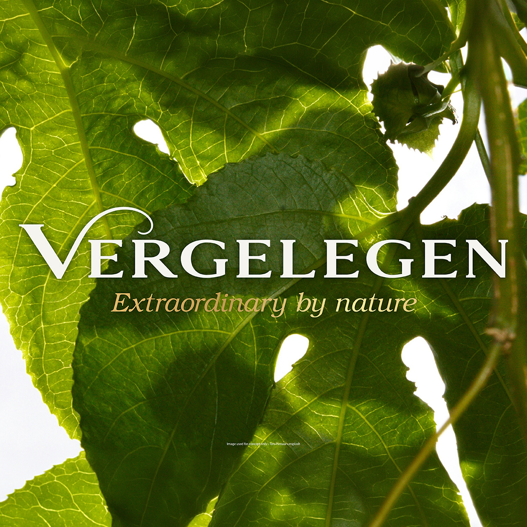
This thinking evolved into a brand that is Historic. Celebrated. Natural. Guided by the positioning Extraordinary by Nature, the identity was designed to express the harmony between the estate’s natural environment and the centuries of human care that have shaped it.
The refined octagon became the unifying symbol of the brand, creating a distinctive framework for five defining anchors: The Homestead, The Octagon, Rooted in Nature, Complex Terroir and The Extraordinary Cellar.
Together, these elements created a flexible identity system built around a simple philosophy: nature, refined through centuries of human care.
A distinctive brand identity that brings together Vergelegen’s heritage, natural environment and craftsmanship in one coherent brand world.
The result is an identity that feels enduring yet contemporary, refinedyet welcoming, giving one of South Africa’s most celebrated wine estates a visual expression that is as extraordinary as the story behind it.
STYLESCAPE DEVELOPMENT
Stylescapes form an important part of our process, creating a bridge between strategy and design. They allow us to explore the visual territory of a brand before committing to a final direction - defining its mood, character, colour, typography, imagery and overall expression.
Vergelegen has long been recognised as a world-class winery, but its visual identity no longer reflected the richness of its heritage, the people behind its legacy or the natural abundance that defines the estate.
Elegant but overly corporate and restrained, it failed to capture the warmth, provenance and craftsmanship that have shaped Vergelegen for more than three centuries.
The challenge was to create a distinctive identity that could preserve this remarkable heritage while giving Vergelegen a more contemporary, welcoming and ownable expression – one worthy of representing South African winemaking on the world stage.
We worked with The Hardy Boys and Vergelegens brand team.
At the heart of the rebrand was a simple truth: everything extraordinary at Vergelegen is rooted in nature.
From the ancient soils and historic trees to the vineyards, architecture and generations of people who have shaped the estate, Roots became the strategic idea that revealed the interconnected systems that make Vergelegen truly extraordinary.
Rather than telling a collection of separate stories, the new identity brings them together through a single idea – the relationship between nature and human craftsmanship.
This thinking evolved into a brand that is Historic. Celebrated. Natural. Guided by the positioning Extraordinary by Nature, the identity was designed to express the harmony between the estate’s natural environment and the centuries of human care that have shaped it.
The refined octagon became the unifying symbol of the brand, creating a distinctive framework for five defining anchors: The Homestead, The Octagon, Rooted in Nature, Complex Terroir and The Extraordinary Cellar.
Together, these elements created a flexible identity system built around a simple philosophy: nature, refined through centuries of human care.
A distinctive brand identity that brings together Vergelegen’s heritage, natural environment and craftsmanship in one coherent brand world.
The result is an identity that feels enduring yet contemporary, refinedyet welcoming, giving one of South Africa’s most celebrated wine estates a visual expression that is as extraordinary as the story behind it.
STYLESCAPE DEVELOPMENT
Stylescapes form an important part of our process, creating a bridge between strategy and design. They allow us to explore the visual territory of a brand before committing to a final direction - defining its mood, character, colour, typography, imagery and overall expression.